Plots in Result Files
Some result files have a Plots subtab under the Results tab of the Result Viewer. In the Plots subtab, the values are displayed using different types of plots. All data for each plot is saved in the result file’s Post Map. If any changes are made in the plot settings or if a post-processing step is done, the result file is updated and saved. Thus, plot appearance stays the same even after closing the Result Viewer.
This updating and saving of plot settings can also be recorded as a macro and always appears in the Session Macro. This means that everything done while post-processing to the plots can also be scripted/automated using Python macros.
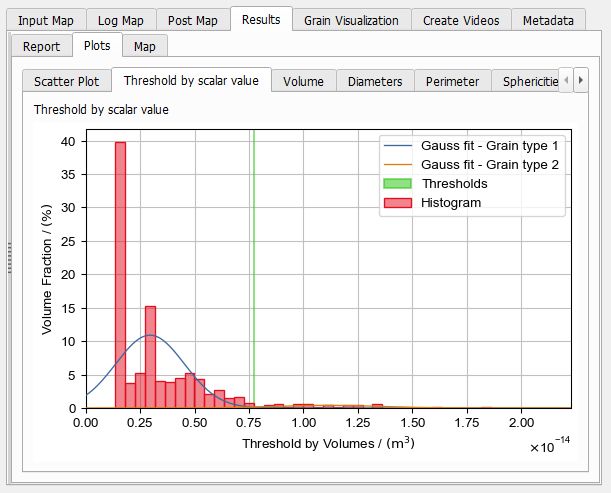
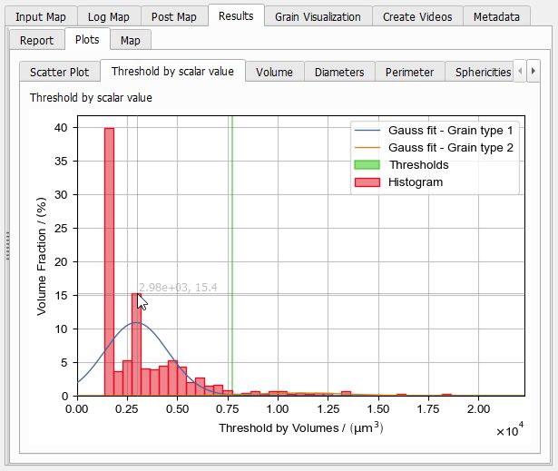
A plot contains at least one graph: a set of datapoints, which has a unique marker and color, e.g. a blue line or a set of bars. All graphs in a plot share the same value range in X and Y axis directions and have unique names that are shown in the legend.
Each plot can have multiple graphs and each result can have multiple plots. Thus, some plots are grouped in other subtabs, for higher simplicity. If there are more than two plots in a subtab, the active plot can be chosen from a drop-down menu. This is often the case for time sequences or similar types of data.
If there are exactly two plots in a group, both of them are displayed. The two plots are separated by a horizontal slider, such that the size can be adjusted.
Hovering with the cursor over the plot will show indicator lines and the values of the axes at the point of the cursor. The first value shown belongs to the X-axis, the second one shows the value of the Y-axis.
Click and hold with the left mouse button and draw a rectangle to zoom into the plot at this position.
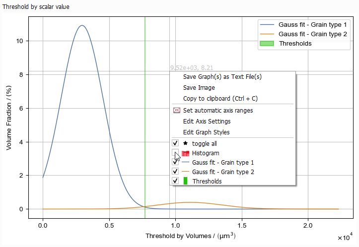
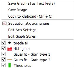
Right-clicking inside the plot area opens the plot context menu. Here, the plot can be exported in different ways, and the plot settings can be changed, especially the zoom can be reset.
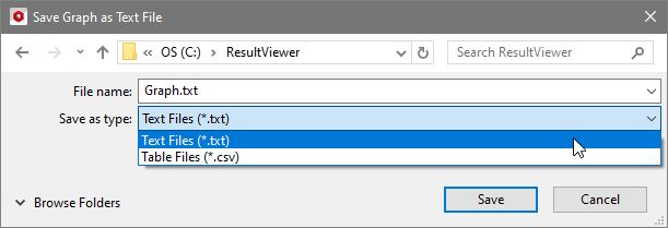
Save Graph(s) as Text File(s)
In the opening save file dialog choose to write all graph points as *.txt or *.csv files. Each graph of the plot is saved in an individual text file.
Save Image
All plots can be saved as pixel (*.png) or vector (*.svg) image by clicking on Save Image. In the Save Plot dialog, choose the filename and the resolution of the saved image.
Via the Browse… button, choose the image format (*.png/*.svg) or simply type in the desired filename with suffix.
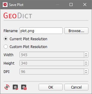
The Current Plot Resolution depends on the current size of the Result Viewer window and the values for Width, Height, and DPI (dots per inches) are entered automatically. With the Custom Plot Resolution option, these values can be freely chosen. Define a higher DPI value to increase font size and line thickness for better visibility, e.g., when using the plot for presentation slides.
Copy to clipboard (Ctrl + C)
Select Copy to clipboard (Ctrl + C) to copy the plot as image to the clipboard (or press Ctrl + C) and then paste it (Ctrl + V) where needed.
Set automatic axis ranges
This will reset the axis settings to be automatic. If you zoomed into the plot, this will reset the zoom to the initial value. This is the same as checking the Scale Axis automatically box in both the X-Axis Options tab and the Y-Axis Options tab of the Edit Axis Settings dialog.
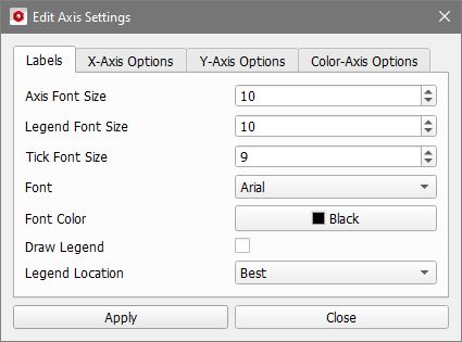
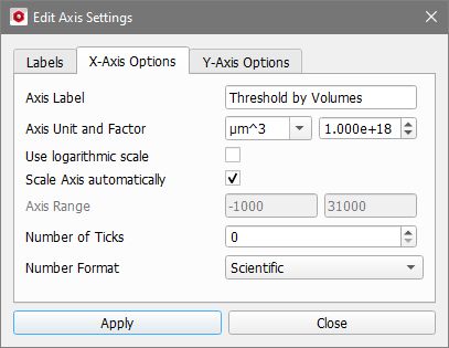
Edit Axis Settings
Selecting Edit Axis Settings opens a dialog to specify the settings for labels and axes. It is organized in up to four sub-tabs Labels, X-Axis Options, Y-Axis Options, and Color-Axis Options. Clicking the Apply button updates the plot and saves the new settings via the PlotSettings Command. Thus, the changes are also stored in the Session Macro. The new settings are automatically saved to the result file, such that the plot appearance is the same when opening the result file again.


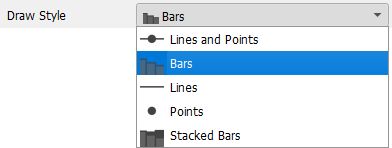
Edit Graph Styles
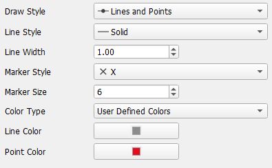
Clicking Edit Graph Styles lets the user choose how each of the contained graphs is displayed. Changes made here are saved to the result file and recorded via the PlotStyle Command.
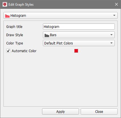
From the pull-down menu select the graph you want to edit. With Graph title the graph is given a new name, which is also displayed in the plot legend.

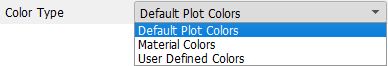
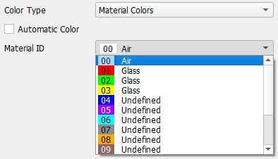
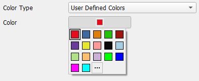
Color Options
The color of the graph can be edited by first choosing a Color Type.

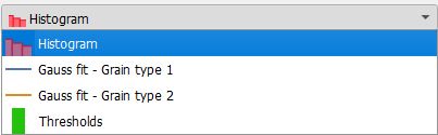
Graph List
The bottom of the context menu contains a part to activate / deactivate the graphs in the plot.
Clicking toggle all deactivates or activates the visibility of all the entries in the plot.
Unchecking one of the entries deactivates the visibility of this particular graph in the plot visualization. It is also removed from the legend.