Custom generated Plots
Generation of custom plots from the combined results
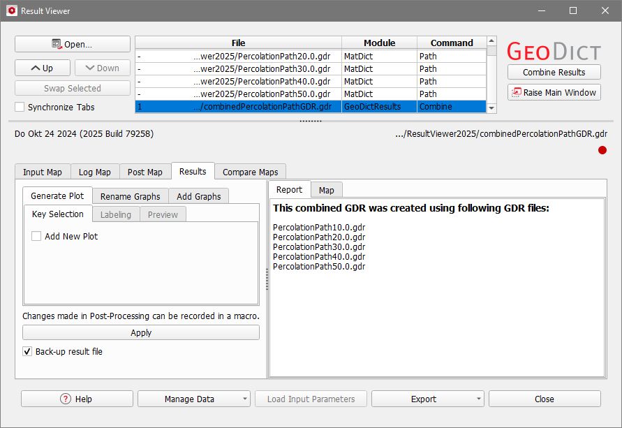
After a combined result file has been generated, it opens automatically and it is possible to run post-processing to generate and edit custom plots from the result values.

|
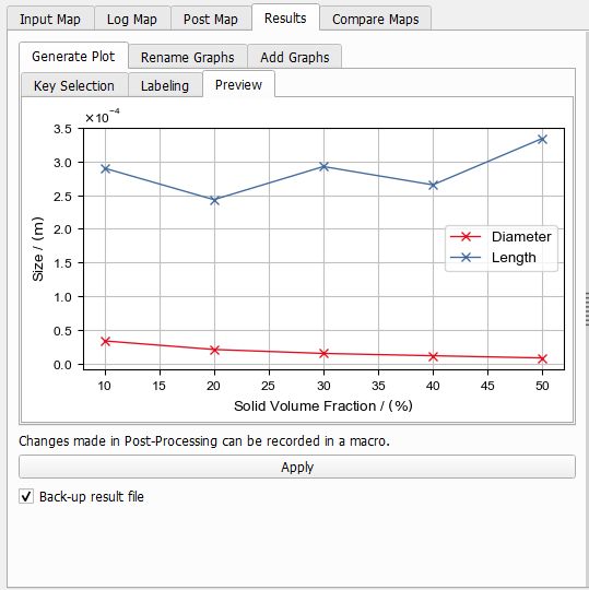
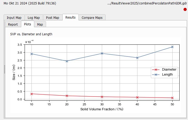
Note! In the example, fiber structures with varying solid volume percentage (10% - 50% SVP) were generated and a Percolation Path was computed for each structure.
|
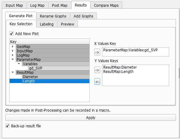
To create a custom plot select the Generate Plot tab in the post-processing panel on the left. In the Key Selection subtab, check Add New Plot to start customizing the plot.
 Select the Keys for plotting
In the subtab, a list (Key) contains the keys that can be used to generate the custom plot. These keys have values that differ amongst the original result files. They are also shown in orange or red color in the Compare Maps tab.
Keys can be used to identify the data on the X-axis or the Y-axis. For the X-Axis only one key can be chosen, for the Y-axis multiple keys are allowed which means multiple graphs are contained in the final plot.
Keys are added in the following way:
- Click on one of the keys from the Key list to highlight it.
- Then, click on the
 icon to add it to the X Values Key or Y Values Keys. icon to add it to the X Values Key or Y Values Keys.
The X Values Key entry is overwritten when clicking the icon again. Single keys can be removed from the Y Values Keys again by selecting them and clicking on the  icon. icon.

|
Know how! Variables that were used in a macro file can also be used as keys in the combined gdr result file. They are found under ParameterMap - Variables. In this example, the *.gdr result files for the Percolation Path were created by a GeoPy script with the variable gd_SVP, containing the Solid Volume Percentage (10%, 20%, 30%, 40%, and 50%).
|
|
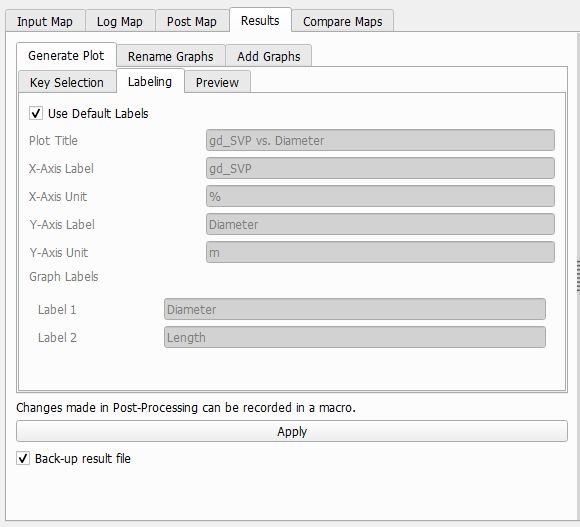
Define the Labels of the plot
In the Generate Plot - Labeling subtab, the Default Labels for the plot are shown. For the axis labels and units, the key name and unit from the result file maps are taken. For the label and unit of the y-axis, the first of the selected keys to be plotted is used. The Graph Labels are shown in the plot legend and correspond to the key names of the Y Value Keys.
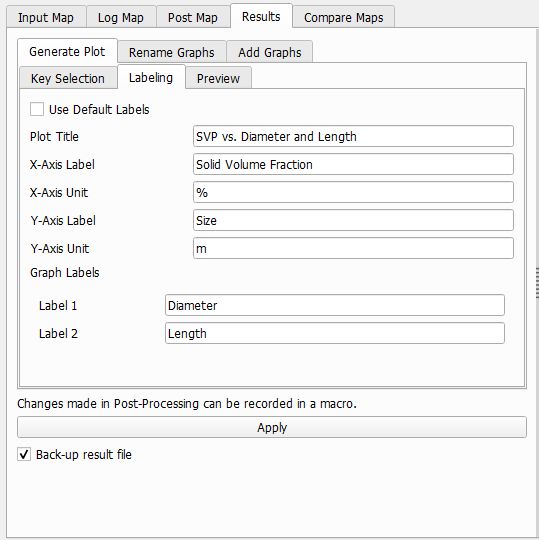
Uncheck Use Default Labels to define custom plot labels for axis labels and units and the graph labels.
|
Preview and generation of the plot
Without clicking Apply… yet, go to the Generate Plot - Preview subtab, where you can control the appearance of your custom plot. Changing settings in the other tabs updates the preview plot immediately.
When clicking Apply…, the plot is permanently saved to the combined result file (here combinedPercolationPathGDR.gdr) and appears under the Results - Plots subtab of its Result Viewer afterwards.
The generation of custom plots is saved in the GeoDict Session Macro and can be recorded as a python macro.
|