|
Navigation: GeoDict 2025 - User Guide > Post-process results > Visualization > Visualization Options > Visualization 2D |
Scroll |
Volume Field
The parameters that control the visualization of the volume field in 2D are under the Volume Field tab of the View Controls and, with a few more choices, in the GUI Sidebar under the Data View u Volume Field tree as well.
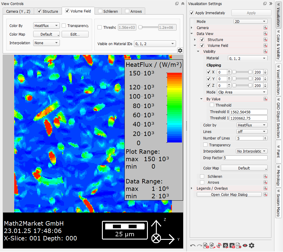

Choose the component to be rendered through the Color By pull down menu. |
Define the color range and which values should be transparent. For a more detailed explanation see below. |
In 2D mode the volume field colors cannot be interpolated. Thus, only None is selectable from the pull-down menu for Interpolation. The different interpolation options are described for the 3D mode. |
Checking Threshold allows a clipping that is not related to the spatial coordinates but to the visualized data range. The areas with values between the respective threshold values appear white/transparent This might be used, for example, to visualize only the flow velocity values between 0.00006 (6e-05) m/s and the maximum of 0.0002 (2.05e-04) m/s. In the Visualization Settings dialog, find the option as Visibility → By Value → Threshold. |
In the View Controls or the Visualization Settings dialog, choose the Material IDs in which the volume field is visualized. This helps in better observing a value of a computed component of the volume field. To do so, select these materials from the Material ID’s pull-down menu. By default, all Material IDs present in the structure are selected. In the case shown here, the flow only happens in the pore space (here, Material ID 00), since the fluid in the structure does not flow through the solids (here, Material ID 01). The flow velocity is displayed in the space occupied by Material ID 00. The flow velocity is not displayed when Material ID 00 is disabled. |
In the Visualization Settings dialog under Visibility you can also clip the volume field as shown for the structure.
|

Points of equal value of the selected local field can be visualized as cross-sections of isolines (appearing as black lines) when changing the default selection Lines→ off in the Visualization Settings dialog (Data View u Volume Field u Lines). 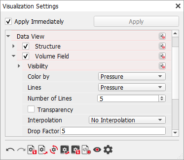 Choose the result field component for the lines. It is also possible to visualize for example the velocity colors, while visualizing the Pressure lines. This gives the possibility to look for correlations. Enter the desired Number of Lines and modify the appearance of the lines through the value Drop Factor. Smaller values for Drop Factor result in larger line shadows, while higher values lead to smaller shadows. |
Color Map
|
Know how! Save all color map parameters for later use in other GeoDict sessions, in a *.gps file or as start-up settings with the corresponding buttons in the bottom of the Color Map dialog. Resting the mouse pointer over an icon prompts a Tooltip showing the icon’s function.  |

Clicking the Edit… button for Color Map… in the Volume Field tab, or Open Color Map Dialog in the Visualization Settings dialog, opens the Color Map dialog to fine-tune the visualization of results. |
Set the value range for the volume field visualization. Define lower and upper value limits and how the data range should be specified. 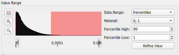 A color map is applied to the given Data Range. The data range can be selected in the following ways:
If Percentiles, Min/Max or Extended is selected, the Material can be selected. Then, only the values within the chosen material(s) are considered for the histogram. If Manual is selected for Data Range, the thresholds can also be set with the red squares in the histogram. 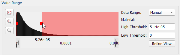 The histogram is displayed on the left and can be zoomed in and out with the Zoom icons. The view can be reset again with the corresponding icon |
 . When zooming in deeply into the histogram and then moving left or right, the resolution is not refined automatically, as it can take some time. Therefore, then click Refine View.
 For many simulation results, it is interesting to “see-through” the volume field and to emphasize certain areas. For example, consider a result from a FlowDict simulation and we want to emphasize where the flow is fast. Click Transparency in the Color Map dialog, and change the shape of the transparency curve by adding and moving new anchor points. To add new points either left-click in the plot and click Add Point on the right or right-click in the plot and click Add Point there. Move the points either by drag and drop or by entering the desired values for Position and Opacity for the selected point. 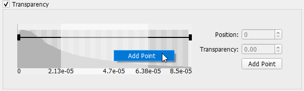 Observe the transparency gradient in the flow field with the following settings: |
In the Color panel, control the color gradient. 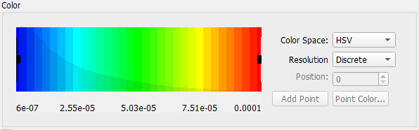 Change the complete Color Space, by selecting a different option from the pull-down menu. The color space defines if and how the colors should be interpolated between two defined points, here the four options RGB, HSV, LAB and Constant are shown for the color preset Cold. The Resolution can be set to Discrete or Continuous. To create your own volume field colors, in the graph points can be added by left- or right-click and selecting Add Point. 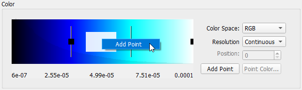 The Point Color of any point can be changed by selecting the respective point and either right-click and select Change Color or on the right click Point Color... The Position can be changed either by dragging the points left and right or by entering a position on the right. 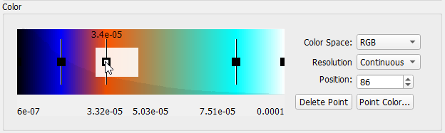 Select between many presets by clicking Load Color Preset at the bottom of the Color Map dialog or save your own presets similar as shown for the Color & Visibility options. 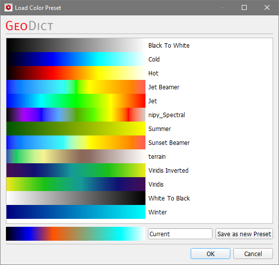 |
The Isosurfaces are only available in 3D rendering. If Apply Immediately at the bottom right of the dialog is checked, these choices are instantly used on the display in the Visualization area, while keeping the Color Map dialog open to make other changes. Otherwise, click Apply to change the visualization settings.  Close the dialog when the visualization fits your needs by clicking Create different color maps in the current session for the different result fields. To do so, in the Color Map dialog enter a Name and click New Color Map in the Color Map dialog or, in the View Controls, unfold the pull-down menu for Color Map and click Add. Edit the settings as desired, and switch between the current color maps by selecting the needed color map from the pull-down menu in the Color Map dialog, in the View Controls or thru the Visualization Settings dialog of the GUI Sidebar. Having different color maps is very useful, if different result fields should be displayed in different color styles. In the Visualization Settings dialog, for each of the result fields under Data View, find the option to select a Color Map for the corresponding result field; here shown for the Arrows.  The Color Map dialog also offers the possibility to rename or remove color maps. Simply select the respective color map and click Remove Color Map or enter a new name and click Rename. |
 in the upper right corner.
©2025 created by Math2Market GmbH / Imprint / Privacy Policy
