Edit Axis Settings and Graph Styles
With the options in the second section of the Plot Context Menu you can edit the way the data is shown in the plots. The settings for the axes and the graphs are done separately.
Set automatic axis ranges
This will reset the axis settings to be automatic. If you zoomed into the plot, this will reset the zoom to the initial value. This is the same as checking the Scale Axis automatically box in both the X-Axis Options tab and the Y-Axis Options tab of the Edit Axis Settings dialog.
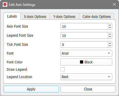
Edit Axis Settings
Selecting Edit Axis Settings opens a dialog to specify the settings for labels and axes. It is organized in up to four sub-tabs Labels, X-Axis Options, Y-Axis Options, and Color-Axis Options. Clicking the Apply button updates the plot and saves the new settings via the PlotSettings Command. Thus, the changes are also stored in the Session Macro. The new settings are automatically saved to the result file, such that the plot appearance is the same when opening the result file again.
 Labels
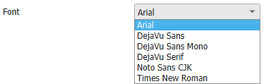
In the Labels tab, the Axis Font Size, the Legend Font Size, and the Tick Font Size can be changed. The chosen Font will be the same for the axis labels, the ticks and the legend. For the axes labels and the ticks, the Font Color can be chosen (default is black). The settings apply for both the x- and y-axis.

|
Note! The default font (Arial) cannot handle Japanese characters. Select the font Noto Sans CJK to display them properly.
|
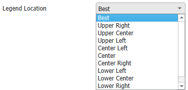
Check Draw Legend if you want to display the legend and select the Legend Location as desired.
|
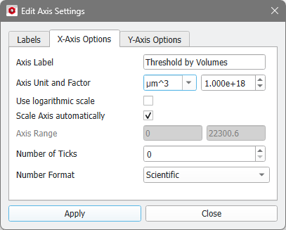
X-Axis and Y-Axis Options
The two tabs X-Axis Options and Y-Axis Options have the same options, but each axis has its own set of options.
The text shown below the axis is changed in the Axis Label box.
The Axis Unit and thus the numbers shown at the ticks can be manipulated. Choose the new unit from the drop-down menu and the Factor, with which the tick numbers have to be multiplied, is automatically adjusted. But you can also enter custom units and have to set the factor correctly.
It is also possible to Use logarithmic scale for every axis by checking it. By default, each axis is scaled automatically, such that all values are plotted. Uncheck Scale Axis automatically to enter a custom Axis Range (minimum and maximum values) in which the data is plotted.
If Number of Ticks is set to zero, an appropriate number of ticks is automatically chosen, otherwise the ticks are evenly distributed between the minimal and maximal data values. Choose the Number Format to be Scientific, Plain, or Integer.
|
Color-Axis Options
The Color-Axis Options tab is only available for plots of special commands, e.g. for the 2D Density Map command in MatDict (shown here) or results from GrainFind and FiberFind.
In these plots, two-dimensional data is visualized using a color map.
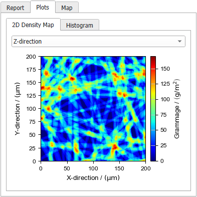
The settings for the color axis are similar to those for the X- and Y-axis. The options Axis Label, Axis Unit and Factor, Use logarithmic scale, Scale Axis automatically, and Axis Range are the same as described before.
Check Interpolate Image to get a smooth visualization.
The visibility of the color map shown on the right can be turned on and off with Show Color Bar.
From the Color Map drop-down menu select a suitable color map. Find examples for the color maps in the Visualization chapter
|
Note! If the Color Map Transparent is chosen, the color defined under Edit Graph Styles will be used to display the data.
|
|
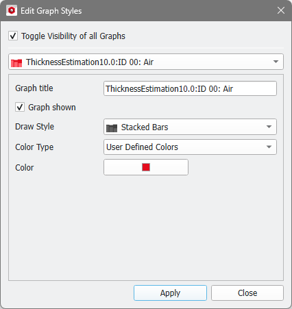
Edit Graph Styles
Clicking Edit Graph Styles lets you choose how each of the contained graphs is displayed. Changes made here are saved to the result file and recorded via the PlotStyle Command.
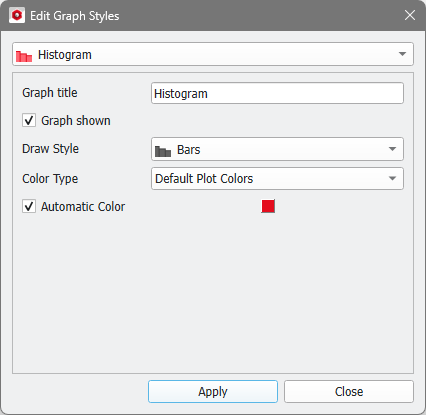
If a plot contains more than 16 graphs, the Edit Graph Styles dialog contains the option to Toggle Visibility of all Graphs at the top. For plots with less graphs, this option is available in the Plot Context Menu (see also the topic Graph List).
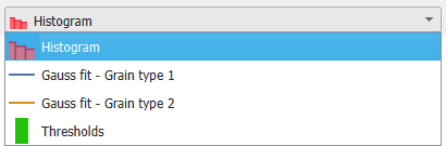
From the pull-down menu select the graph you want to edit.
Change the Graph title to give the graph a new name, which is also displayed in the plot legend. Below, check Graph Shown if it should be displayed in the plot or uncheck to hide this graph.
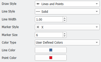
Style Options
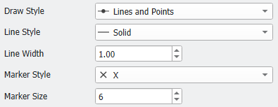
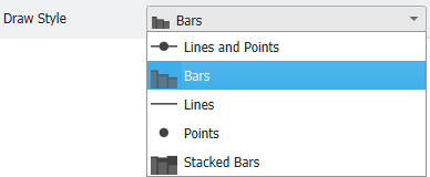
Choose a Draw Style, which can be Lines and Points, Bars, Lines, Points, and Stacked Bars.
If a graph contains Lines and/or Points, the Line Style (Solid, Dashed, Dotted or Dashdot) and Line Width and/or Marker Style (different shapes) and Marker Size can be edited.
|
Color Options
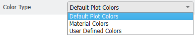
The color of the graph can be edited by first choosing a Color Type.
Default Plot Colors
By default, an Automatic Color is selected, which can be changed when unchecking the box. Then, a small selection of default colors is available.
|
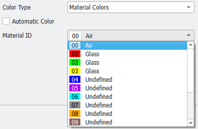
Material Colors
For Material Colors the same color map as for the Material IDs is used. If an Automatic Color is assigned, the first plot has the color of Material ID 00, the second plot has the color of Material ID 01, and so on.
|
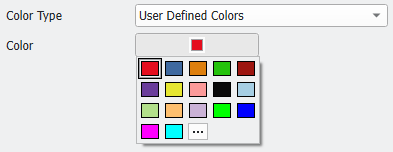
User Defined Colors
For User Defined Colors, there is no Automatic Color.
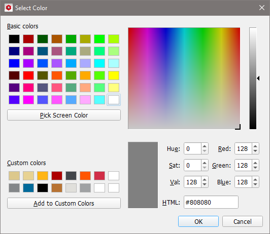
To change the default color to a user-defined color, select the three-dots icon.
In the opening Select Color dialog enter the RGB values that define the color and click Add to Custom Colors. Alternatively, the rectangle for the new color can be dragged to occupy the place of the old one in the custom colors.
The new color setting is applied to the material after clicking OK.
For the Draw Style Lines and Points it is possible to select different user defined colors for the lines and the points, respectively.
|